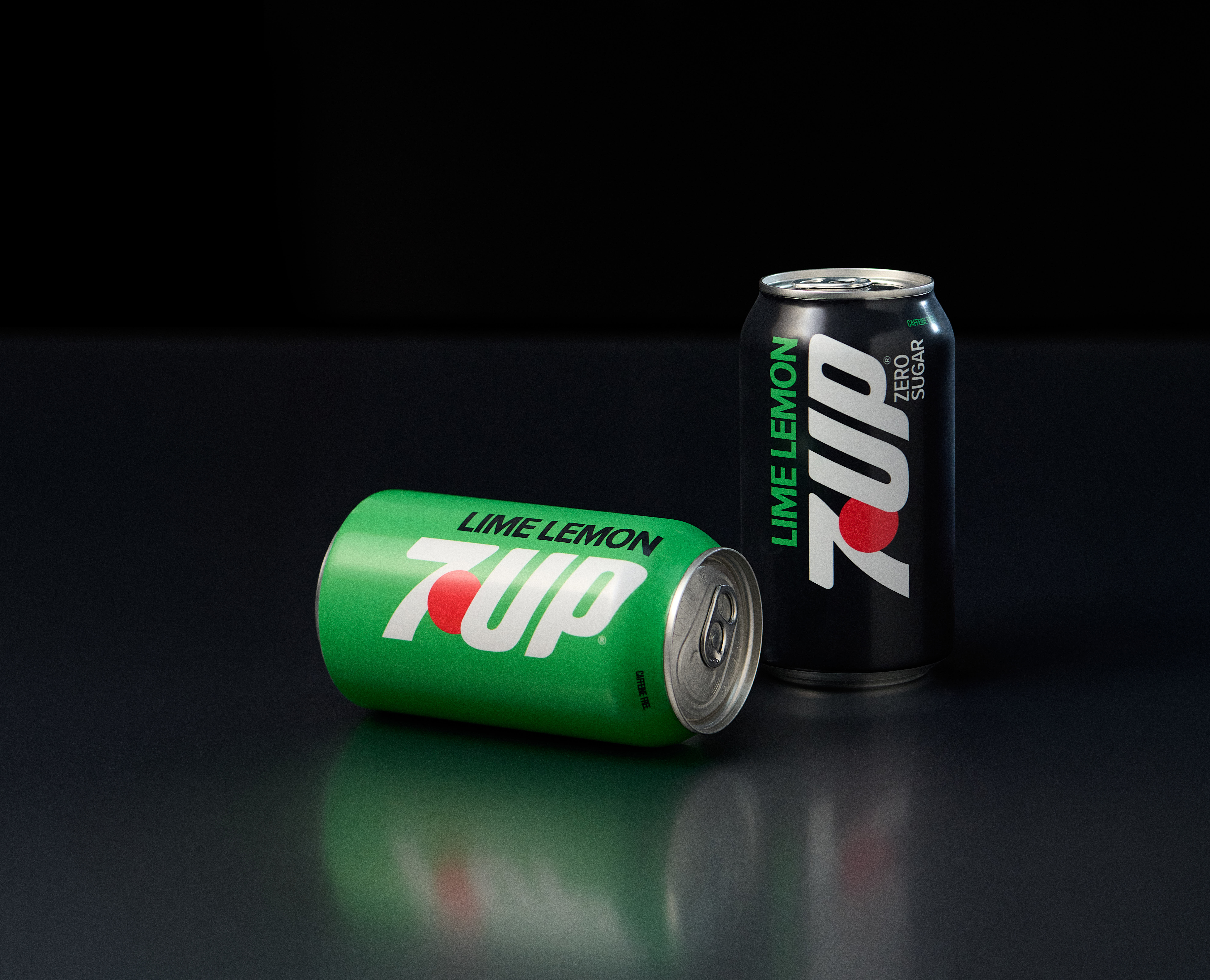
Beverage drinkers thirst for clean, crisp refreshment. 7UP takes a new approach to the classic bright, bubbly drink. With a new look and flavor focus, the uncola’s flipped sip tastes even better.
Food and beverage trends continually evolve. Dirty soda adds creamy, luscious sweetness to the glass. Caffeinated boosts help people through the dragging parts of the day. Even favorite, classic beverages have changed their approach.
While the liquid in the can is the most important, how that drink is packaged matters, too. Bright colors, clean fonts help to captivate attention on the shelf. When a buyer can instantly identify a brand, it makes that purchase much easier.
7UP enters a new era both in flavor and design. The original “uncola” is now the lime lemon soda. That flavor flip combined with the new package design asserts that this beverage amplifies its drinking experience. Ready to crack open a can?

Why Is the Original Uncola Putting the Lime First?
According to recent surveys, Gen Alpha and Gen Z want more citrus forward flavors. These demographics seek bright, zesty forward beverages. Additionally, consumers want bold flavors. Subtly is out. Every sip must deliver a taste that hits strong and never fades.
By putting lime first, the classic soda has a noticeably stronger citrus note. Instead of a subtle tangy citrus with a touch of sweet, the lime is tangy, tart. It hits first and has a long finish. It does not feel as if a whole lime was juiced in every can, but it is definitely more acid forward in an enjoyable way.
Switching the sip ensures that 7UP is different than other beverage brands. As cola brands have come to embrace, uncola drinks should not be interchangeable. By making sure this option is lime-centric, it appeals to trends, savvy consumers, and others who have discerning tastes.
Lastly, this lime-lemon change is a permanent reformulation across all the brands. From Cherry to Zero Sugar, all options are lime-forward. For the Cherry flavor, it feels lighter, more refreshing, and quite drinkable.
7UP’s New Package Design Blends Past and Present
After testing 10 concepts, the brand picked this new look as a modern interpretation of its history. Just at a glance, it is familiar, but with a visual that denotes the new direction.
The modern graphic design has bolder colors. Still within the classic scheme, the greens pop and contrast with the red. Consumers eyes instantly settle on and identify the brand.
Additionally, the vertical logo sets it apart from other beverages. While not a traditional “disruptive” measure, being different is another attention grabber. From the shelf to the feed, people will take notice.
Lastly, the design makes the “lime-lemon” distinction part of the conversation. Again, it is another way for the beverage to set itself apart from its competitors.
Overall, these adaptations are smart for the company. With the shelf becoming more crowded, every company needs to find a way to keep fans engaged and convert new consumers. New looks, uniqueness, and excitement are all positive attributes that covert sales.
The flipped sip of 7UP Lime-Lemon is rolling out into stores now. To be clear, it is not a limited-time flavor. The new packaging and lime-forward amplification are a permanent part of the brand.


Leave a Reply